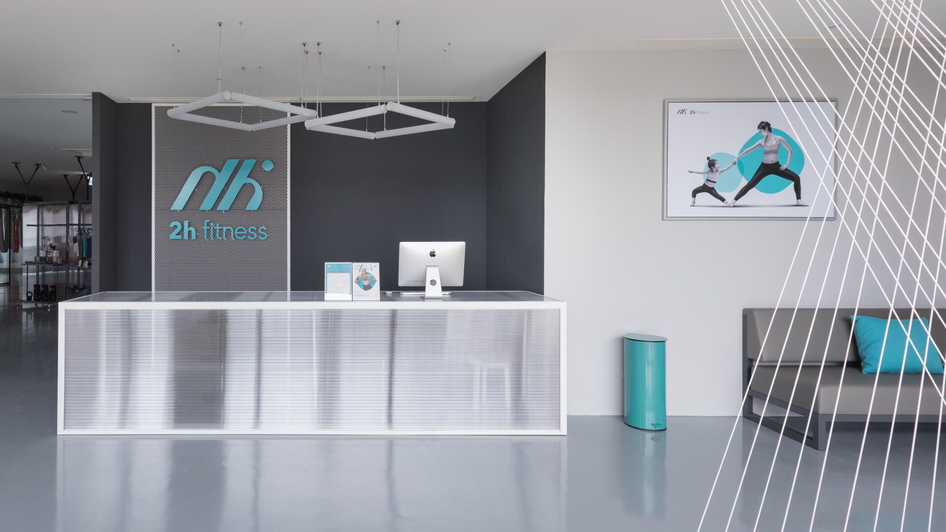
Expressing brand values through structural form
The visual identity distills three movement-inspired ideas: mirrored h–h forms symbolizing trust, rounded-rectangle shapes referencing impact and energy, and the dual core of health and happiness. A grey–teal–orange palette balances vitality with calm, while modular layouts, rounded geometry, and typographic restructuring unify the system. The identity extends across cards, packaging, equipment, and wayfinding to form a consistent, dynamic visual language.