The Convergence of Fashion and Function
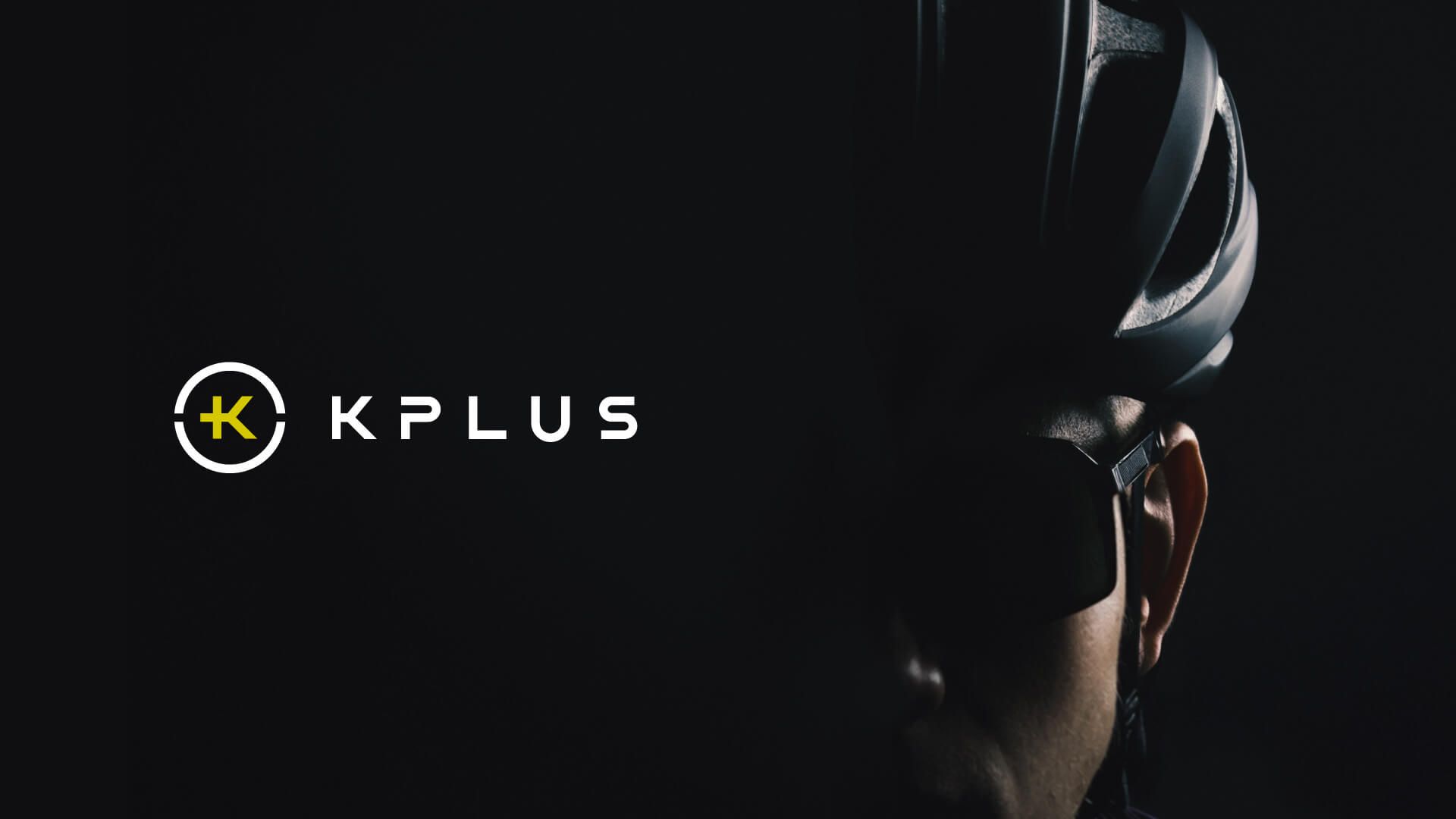
The visual identity integrates the “+” symbol with the letter “K,” nestled between an upper semicircle (representing a helmet) and a lower semicircle (representing a smiling face), perfectly embodying the “KEEP +HE PLEASURE” spirit. The color palette combines modern black with energetic yellow, capturing both the intensity of racing and the style of urban cycling.
The packaging design is equally innovative. For the “Urban Series,” we created a smart, dual-purpose box featuring windowed illustrations of male and female riders, allowing consumers to visualize different styles while optimizing production costs. For the “Pro Series,” matte-finished handmade boxes with handles evoke a premium unboxing experience, reinforcing the brand’s high-end positioning.