Dynamic Identity with Human-Centered Mind
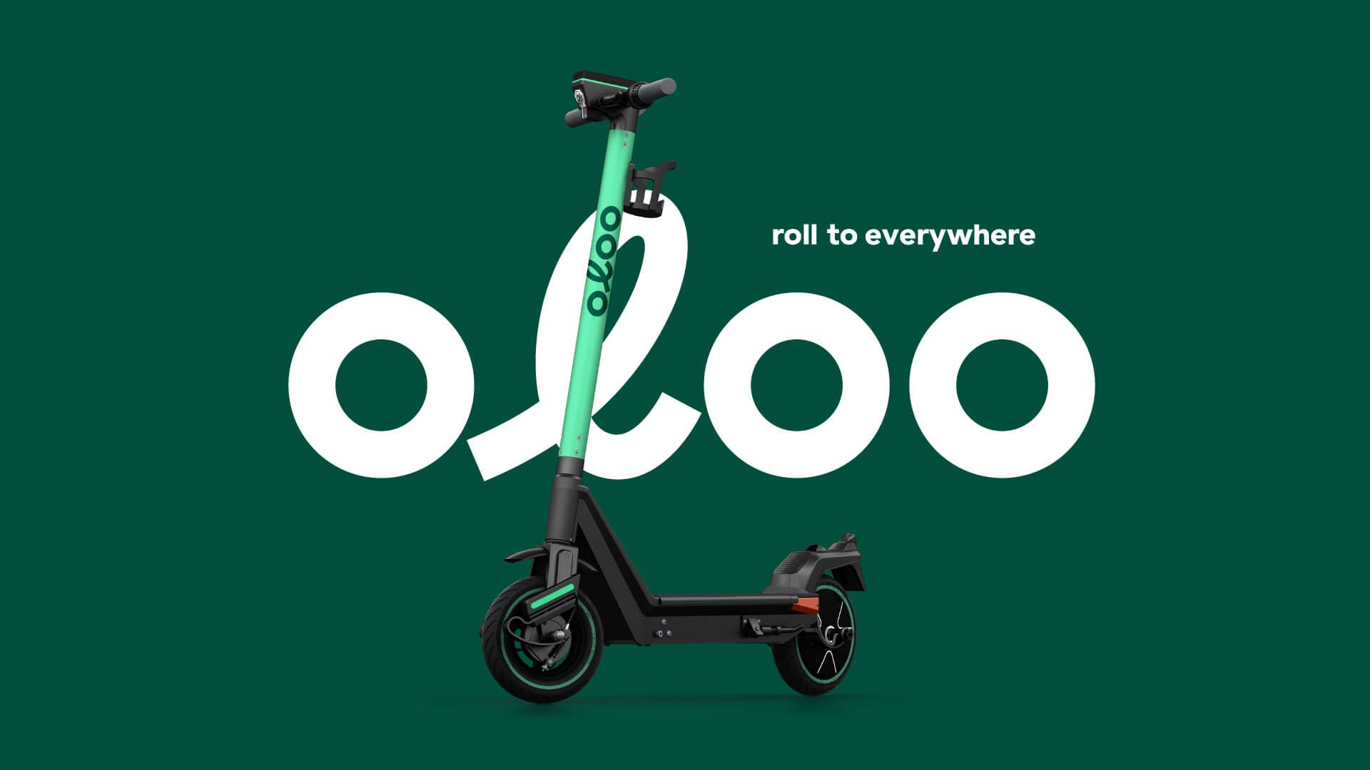
The oloo logo features a handwritten-style “L” that echoes the posture of a rider on a scooter—visually embodying the brand’s focus on user connection. Paired with motion-inspired typography and multitrack lines, the visual identity evokes a spirit of “rolling and exploring.” The primary palette of greens, grey, black and white hints at nature and imagination toward dinosaurs’ life, while reinforcing a clean, future-forward impression.
Our comprehensive design system spans vehicle livery, helmets, app interfaces, web design, and branded merchandise. The brand voice—humorous yet consistent—extends across touchpoints, from UI to social media. We applied rhythmic visuals and expressive copywriting to build distinct recall and cohesive experience, successfully establishing Taiwan’s first micro-mobility brand.